Pilates Pods Studio
CASE STUDY
THE CHALLENGE
Develop a unique voice that emphasized the benefits of Pilates, it’s accessibility to everyone, and increase the visibility of the Pilates Pods brand.
OUTCOME
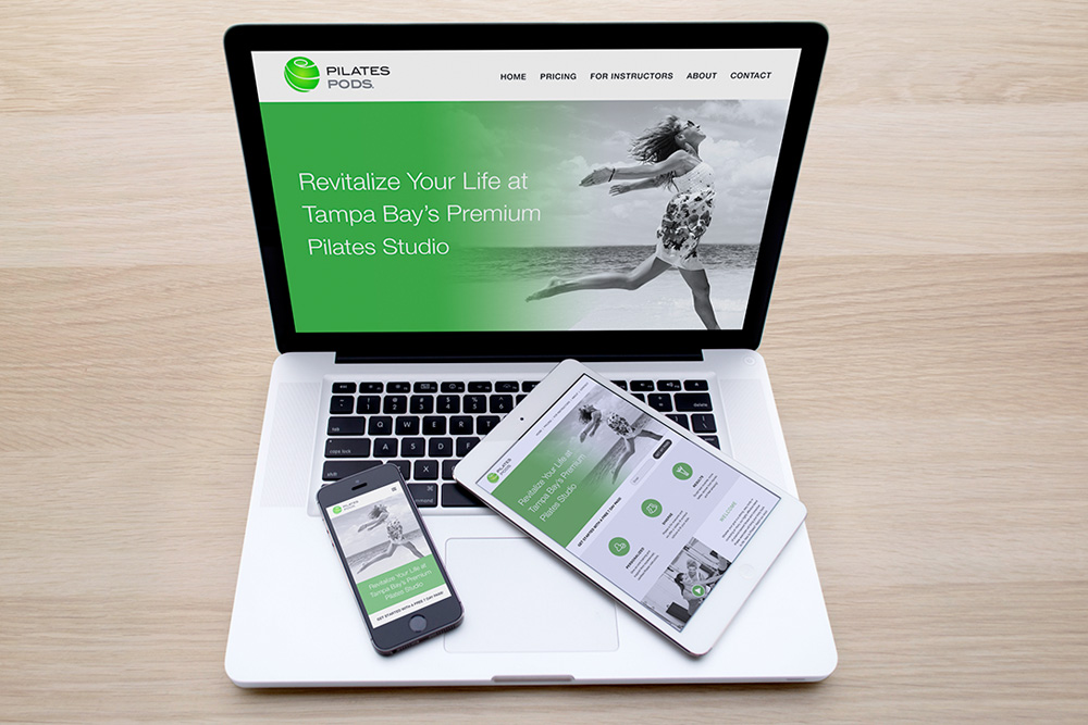
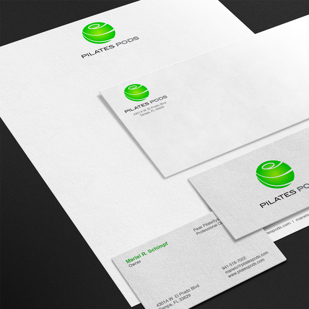
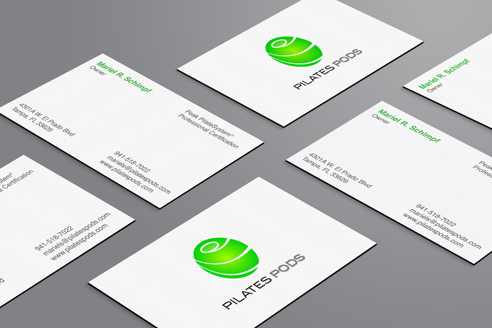
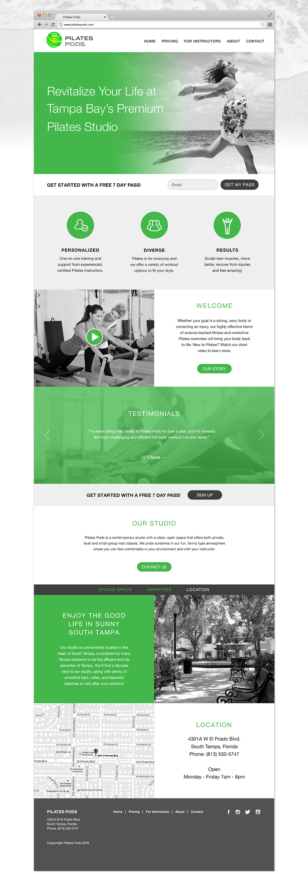
A logo, website, and marketing materials that supported Pilates Pod’s as the premiere pilates studio that caters to sophisticated women looking to regain strength and vitality.
SERVICES
Strategy, Messaging, Branding and Identity Design, Web Design
BACKGROUND
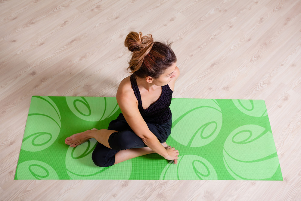
Pilates Pods is a small, independently owned studio located in South Tampa, Florida. The owner, long time fitness professional Mariel, was opening her studio and enlisted my help for the logo design. In addition, I offered to develop a brand strategy and identity system. Mariel wanted a modern "pod" logo mark that was different from the organic, floral logos of other competitors. Motion and flow were also words I used for creative direction.
BRAND DEFINITION
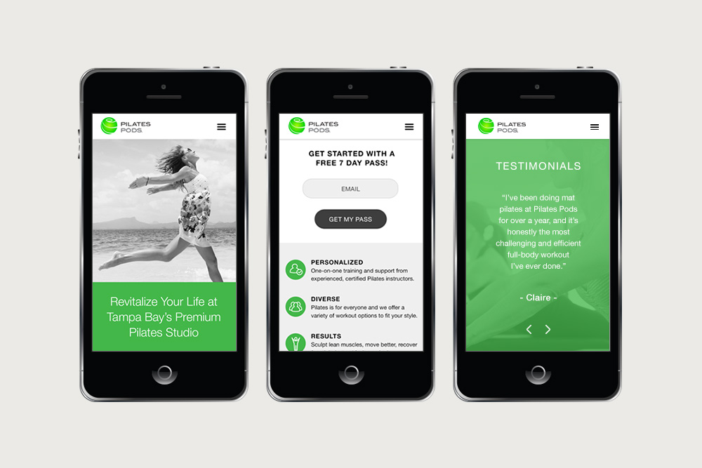
An in-depth brand attributes session was conducted to define the brand’s mission, customers, and values. What emerged was 3 key attributes: Revitalize, Realign, Rehabilitate. Revitalize Your Life became the key message.
AUDIENCE
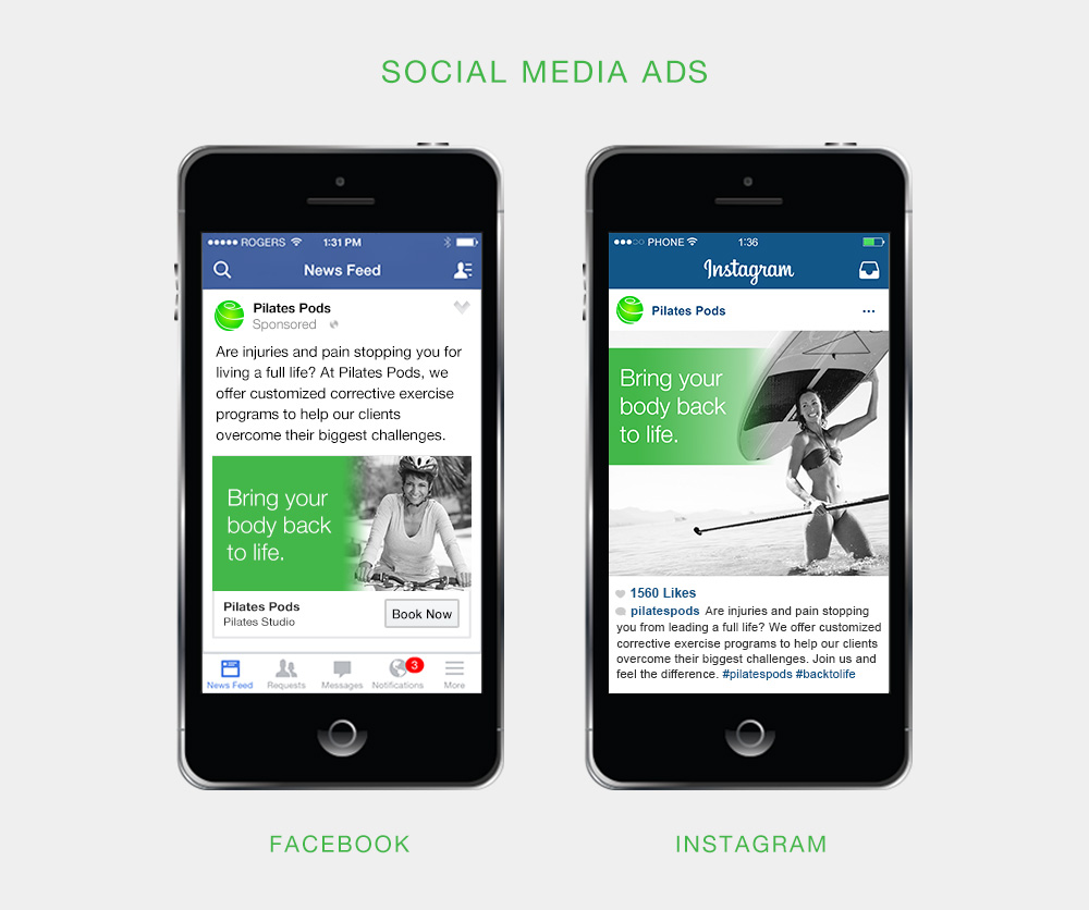
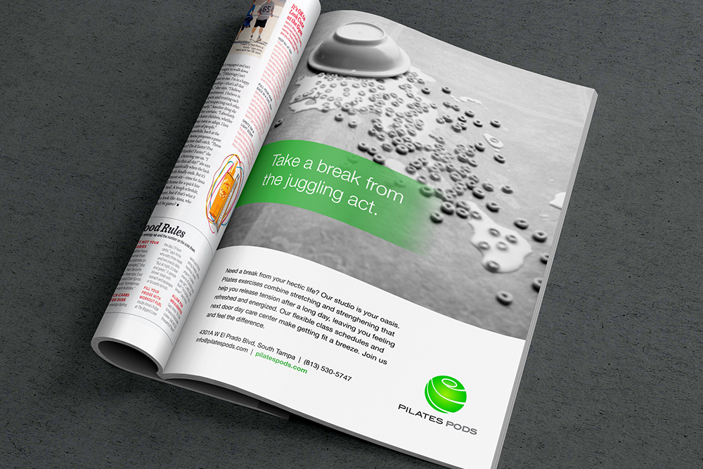
Pilates Pods caters to an upscale, professional client base. Clients are often looking to overcome injuries so they can get back to the physical activities they love. Also many clients are busy mothers who come to the studios as a way to unwind and recharge from a busy day. The website includes facts about the location and nearby amenities that add to the wellness lifestyle. The following ads extend the studio's message on social media and advertising.
